Definition
- Zebra table is when there are alternating white-and-grey stripes on a table.
Current Recommendations:
- Never Edward Tufte: never use zebra tables, adjust the typography
- Jessica Enders: alternating single shaded rows likely has the best lookup task performance and highest subjective user preference.
...
Research
Table of Contents minLevel 3
Edward Tufte's Website: zebra tables and lists
Linkhttps://www.edwardtufte.com/bboard/q-and-a-fetch-msg?msg_id=0001IV
"Again, this is a solved problem, with examples in Envisioning Information, chapter 3. Strips are merely bureaucratic or designer chartjunk; good typography can always organize a table, no stripes needed."
...
Another suggestion, by Matthew Ericson, on how to get around Zebra Tables.
...
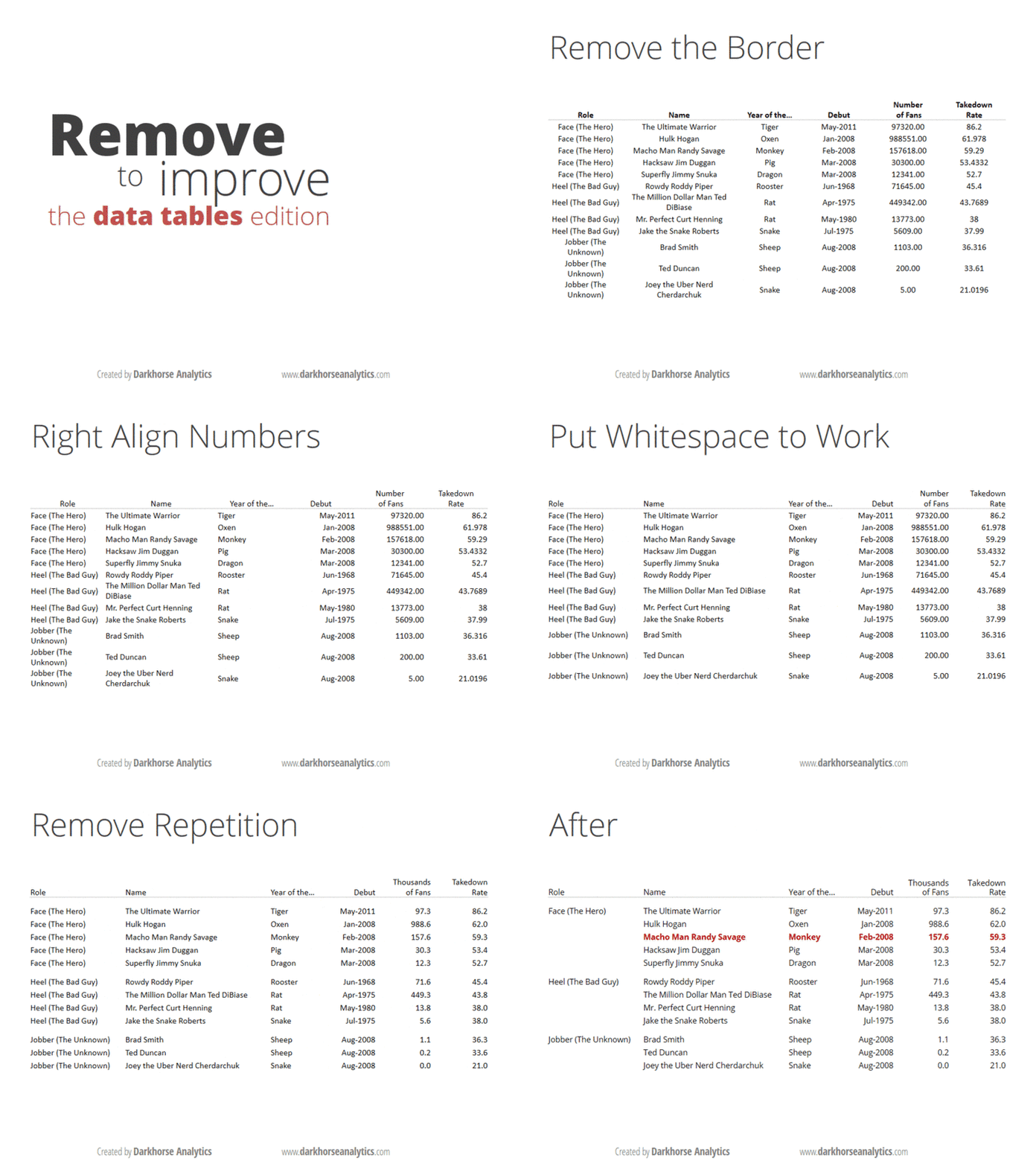
Darkhorse Analytics
From: darkhorseanalytics.com
Link to step by step slides: https://www.darkhorseanalytics.com/blog/clear-off-the-table
Comments:
...
Zebra Striping: More Data for the Case by Jessica Enders (10 Sept 2008)
https://alistapart.com/article/zebrastripingmoredataforthecase/
Jessica initially thought zebra stripping would improve performance. She ran two tests to test this.
Analyzed performance (speed to look up something in a chart) across 2276 surveys online.
Zebra striping improved the success rate in numerical lookup with statistically significant accuracy across several different parameters. (Statistically significant in yellow. Orange is p=0.0545. No highlight is not significant.).
Question: What was the change in speed between these studies?
Criticism: This is the table that was presented. It is unclear what these tables looked like in their plain and lined versions and how the text and line spacing was adjusted. From the study below, it appears the spacing wasn't adjusted.
Also, this columns are quire far apart
User preference
Jessica makes the argument, that is striping doesn't harm usability, and if users prefer it, then perhaps its should be included. The third study was to test user preference. Users were asked to rank these tables in order of preference from first to last.
These images could not be presented in a random order to the user in the question.
The final results show the following user preferences.
- The least liked charts are plain and triple striped.
- The most liked are single striped, double striped, and lined
- Note: the two-colour option has 15% of people who liked it least. Whereas single-striped and lined has less people like it less
...
Design Better Data Tables by Matthew Ström (3 Aug 2016)
https://medium.com/mission-log/design-better-data-tables-430a30a00d8c
Font: ensure its Lining (not old style).
Font: ensure its tabular, not proportional
Example the font: Work Sans (link to Google Fonts).
How to enable tabular lining in CSS: CSS-Tricks article.
Alignment
Textual data: left-aligned
Numerical data: right-aligned
Column headers: aligned with the data
No center alignment
Units: include only with the first data point in each column
Rules:
Vertical rules likely unneeded
Horizontal rules allow you to have less vertical space
"Zebra striping is bad."
...
Web Typography: Designing Tables to be Read, Not Looked At | Richard Rutter | 31 Oct 2017
https://alistapart.com/article/web-typography-tables/
Excerpts form the article:
Align to the decimal point: how to with CSS
"The syntax of the new value is simple. You include the alignment character (usually a full stop or comma) in quotes, followed by a space and your desired alignment keyword, which defaults to right if you omit it. For example, the following will centre the data and align to a decimal point as in our prior example:"
td { text-align: "." center; }"To specify tabular lining numerals, set the font-variant-numeric property with a value of lining-nums and tabular-nums:"
table { font-variant-numeric: lining-nums tabular-nums;
}
"The equivalent properties for legacy browsers requiring font-feature-settings, use the lnum and tnum OpenType feature tags."
"If you need to specify proportional numerals, set the font-variant-numeric property with a value of proportional-nums. For legacy browsers requiring font-feature-settings, use the pnum OpenType feature tag."
Oblique headings to save space
"You can use a simple CSS translation to achieve the effect. You will also need to absolutely position the headings so the original width of the columns isn’t retained and they shrink to wrap the data instead."
th {
    transform-origin: bottom left;
    position: absolute;
}
th.degC {
    transform: translate(2.58em,-2em) rotate(-60deg);
}
th.degF {
    transform: translate(5.14em,-2em) rotate(-60deg);
}
Scroll the table offscreen
.fig-table {max-width: 100%;overflow-x: scroll;}
"It is important not to set a width on your table; the browser can then compress the table as far as it can before overflowing off the screen. To preserve readability, make good use of non-breaking spaces and white-space:nowrap to limit the amount the data wraps in the cells. It’s better to have a readable table that requires scrolling than an unreadable one which doesn’t."
...
Responsive Tables
Examples of Tables
Filament Group
http://filamentgroup.github.io/tablesaw/demo/modeswitch.html


