OUTDATED
This page is outdated, and will be replaced by the project here: OpenMRS 2.0 UI Content
[edit]
Introduction
The User Interface working group is interested in improving the OpenMRS User Interface. This effort is very closely related to the WorkingGroup/Visualization effort. The UI development, and this wiki page, are both very much a work in progress.
[edit]
Design Philosophy
- User-centric! OpenMRS users should be clearly defined and OpenMRS should be tailored to meet their specific needs
...
- Programmers are not actual users
- If I & others on this list like something, that’s nice, but the real test is what a naïve user thinks, in an interview that is not conducted by the designer.
- A perfect example of this is Cohort Builder. Paul and I spent a long time over many meetings arguing about the interface, until we finally came up with something that we were both really happy with. Except that most users I’ve met--from Rwandan villagers to Harvard epidemiologists--find it hard to use. Oops. I have been cultivating a Zen-like detachment from criticisms of my user interfaces. I recommend that everyone else do the same. :)

- “It's hard to get good usability without identifying the users and the common use cases” -Yaw
- We have done this for our PIH clinical projects, which you can see at http://forum.openmrs.org/viewtopic.php?f=22&t=346. We have not yet factored in a project in Peru where we’re just doing deidentified collection of study data under a completely different workflow. And clearly you all on this list have other types of users and workflows. Please tell us about them.
- Bob is doing these mockups, and many of the new feature ideas come from him. He’s far better at it than any of our programmers would be, but his weakness is that he’s overly informed by Lesotho, and less by other installations and use cases. That is to say: please tell us about your use cases and workflows.
...
- User Interface should be designed for end users, and not driven by the data model or by programmer terminology
- One reason it’s better to have a non-programmer doing UI mockups is that they’re not constantly thinking about what’s easy or hard to do, but just want users want.
- Also, when we’re done with this redesign, you will never see the word “voided” on a user screen again.
-Darius
[edit]
User Research
...
User Interviews
We're conducting user interviews to better understand who our users are, their needs and their preferences. Here are the individual interviews so far:
...
The redesign of the UI should make it as easy as possible for all roles to accomplish their primary goals.[edit]
User Testing
(coming)
[edit]
Design Discussions
There's been a lot of thought going into User Interface design. Unfortunately, none of it was previously well documented here. For some discussion from a while back, go here
Here is a link to a zip file containing a round of mockups from 08 Feb 2008. Media: OpenMRS_redesign_mockups_08feb2008.zip
Very nice designs Bob. There are some interface enhancements in usability forum: http://forum.openmrs.org/viewforum.php?f=22 -Ben 13:53, 13 February 2008 (CST)
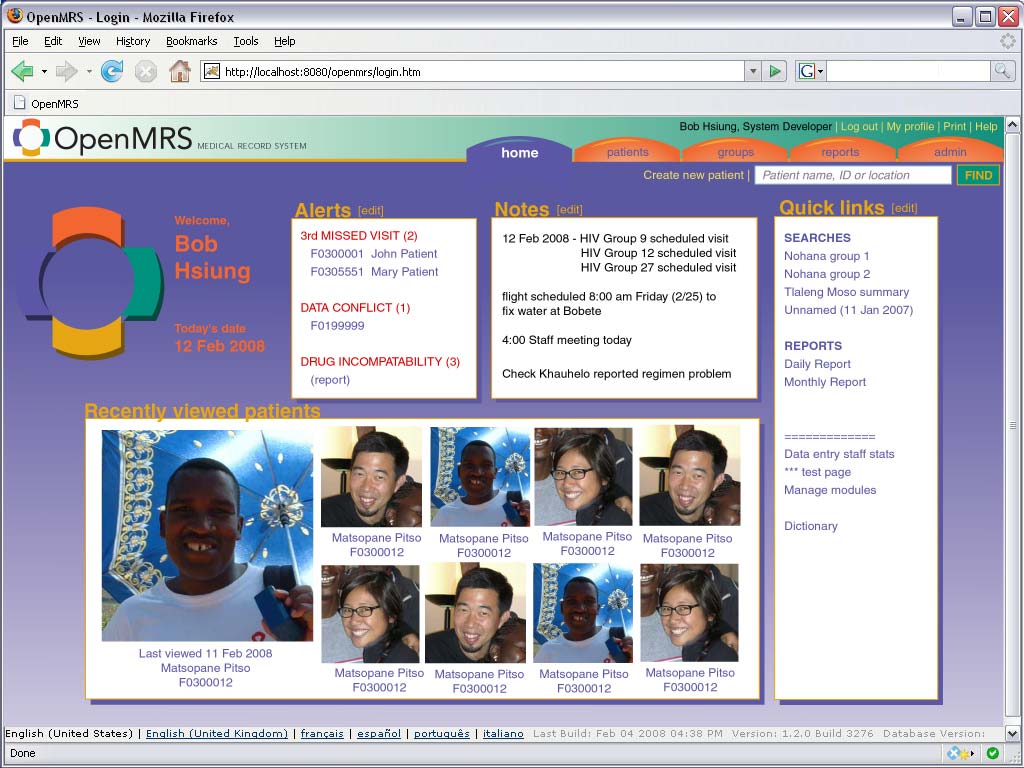
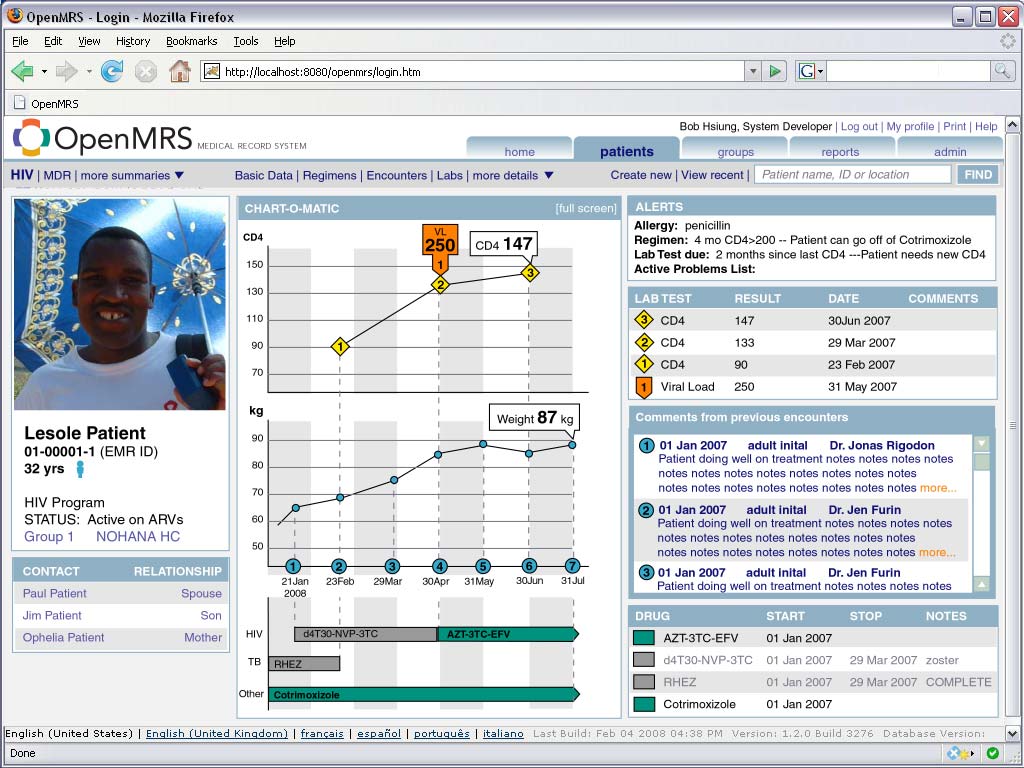
We showed the previous round of mockups to Paul English. He said he thought they looked really good & made some recommendations which are reflected in this new set of mockups of 15 Feb 2008. Most notably, the side patient dashboard has been completely removed. More images were added as well as a 'home' page which is necessary because of the top tabbed menu change. Basic Data entry page has been greatly simplified. Media: OpenMRS_redesign_mockups_15feb2008.zip
...and here's the latest round of mockups. The tabbed menus have been refined - they do not change when viewing patient data as in the previous version. Instead, there is a rich submenu that includes the simple search as a popup widget. The patient summaries and visualizations have been simplified. A "most recent patients viewed" screen has been added.Media: OpenMRS_redesign_mockups_22feb2008.zip Bhsiung 16:00, 22 February 2008 (EST)
Here is a sample from the most recent batch of mockups. It represents a customized start page for a user. (pictures changed for legal reasons) http://archive.openmrs.org/wiki/Image:Home_20feb2008.jpg
Here's a quick alternate color scheme for the UI that's more along the lines of the existing one. Since it'll all be in CSS, the colors will be very easy to customize. http://archive.openmrs.org/wiki/Image:UI_mockup_Alt_color_scheme.jpg
Here is another batch of mockups. The major changes in this set are that the top tabs have been reduced to just four - Home, Patients, Groups & Admin. The Patients area hasn't changed much other than taking some emphasis away from the pictures and removing the Recently Viewed page as it's redundant w/ the Home page.
...
In this revision, we've tried to address all of the issues brought up in the 2/29 meeting. We've given everything the blue/gray scheme that everyone prefers. We tailored the home page specifically for clinicians. The group (cohort) builder has been refined. Now the basic search is extremely simple and results are shown on the fly. The advanced search combines a lot of features which will be useful for more sophisticated users. We added an idea for a key indicators chart which would be useful for program managers. Media:Openmrs_mockups8_11mar2008.zip Bhsiung 12:02, 11 March 2008 (EDT)
[edit]
Ideas and Future Work
Attachments
| Attachments | ||
|---|---|---|
|

