"Design systems define a collection of design patterns, component libraries and good design and engineering practices that ensure consistency in the development of digital products. We've found design systems a useful addition to our toolbox when working across teams and disciplines in product development, because they allow teams to focus on more strategic challenges around the product itself without the need to reinvent the wheel every time they need to add a visual component." |
Summary
A shared, clear Design System will help us have consistency among contributors w.r.t. how things should look. This is especially important given we don’t have dedicated long-term UX resources. We want it to be fast for devs to contribute meaningful work.
For future frontend design and development, we are trying to decide between third party Style Guides, and whether we want to implement those third party’s complete Design Systems. This is not about re-doing our current as-is RefApp; rather, as we move our Frontend vision forward, this decision is currently blocking frontend design and development efforts for the Micro Frontend squad. The MFE Squad has reached consensus that a 3rd party Design System is the way forward, and so far this is also the resounding feedback we’re hearing from others in the community.
See the existing OMRS style guide here; or MFE squad style guide here.
What we need to decide now:
- Which Style Guide to use for future frontend design and development → We recommend trying Carbon Design
- Whether to use a full Design System → We recommend using the full Carbon Design design system, along with the gains in framework guidance
Rationale: Why We're Doing This
A shared, clear Design System will help us have consistency among contributors w.r.t. how things should look. We don't want to spend precious technical time deciding details of how widgets should look and behave - we want to focus on the clinical use/workflows for those concepts, and allow another community to worry about the rest of the details. This is especially important given we don’t have dedicated long-term UX resources. We want it to be fast for devs to contribute meaningful work. And, it’s much better to figure out our design framework and styling sooner rather than later. We don’t have the resources to build/maintain our own design system. Group consensus thus far is that a 3rd party Style Guide or full Design System makes the most sense in our case.
Why Now
Our vision of an amazing future for OpenMRS led us into working on a Micro Frontend development approach, where many implementations and volunteers could contribute to a shared, congruent-feeling, modernized, stable front-end experience. We are now underway planning a 3.0 Frontend and we would like contributions to this frontend to be consistent and share-able across contributors. The Micro Frontend squad no longer has a dedicated UX lead, so the squad has increasingly felt the pain we've experienced across the community for a while: there are not enough UX resources to guide new design in a way that makes it easy for devs to contribute quickly.
See more in Recent History of Style Guides in OpenMRS below.
Terms: What’s the difference between a Style Guide and a Design System?
Style Guide: A style guide is the visual guide to how things should look and behave. This is the world we ground our design decisions in.
Design System: The Style Guide linked to code you'll use in your actual code base - the how. A design system is a guide for making decisions about how interfaces should look, how they should be structured, and the patterns according to which user experiences are structured. One clear example of this is Carbon’s Patterns. Bootstrap doesn’t provide this kind of thing.
Component Library: A component library is a collection of components that come with some style and behavior. The purpose of a component library is to avoid having to create things that are somewhat common but not part of the HTML spec, like multi-selects and modals.
Why use a Style Guide?
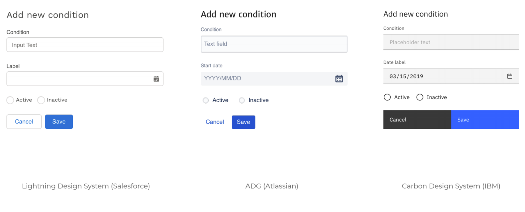
Without a style guide, it is not clear what the expectations are for all kinds of UI elements - which can create a messy, inconsistent user experience.
Example 1: Unclear structure guidance
Example 2: Same form with Style Guides applied
Why use a 3rd party Style Guide or Design System?
Users want a consistent, professional front-end UI. | A shared, clear Design System will help us have consistency among contributors w.r.t. how things should look. This is especially important given we don’t have dedicated long-term UX resources. |
We want it to be easy for new volunteers to contribute meaningfully. | We want it to be fast for devs to contribute meaningful work. An OpenMRS-specific style guide increases the learning curve. Of course, there is a learning curve when using a 3rd party resource as well, but the flip side is that this gives the developer experience using a much more widely-used Style Guide. Knowledge of that particlar style guide, or how to navigate mature style guides in general, may help the contributor later in their career. |
We have limited Design Resources - and the designers that become available, we want to use very efficiently. | We don’t have the resources to build/maintain our own design system. There are not enough skills, resources and knowledge within to build, maintain an internal style guide, and its better to leverage work and investments done by others in the industry. Requiring designers to start from scratch or maintain/change our own custom Style Guide(s) constrains the ability for implementors to leverage non-OpenMRS UI designers and contractors to extend and implement UIs, and places extra burden on implementors to learn the OpenMRS way. While having our own style guide is very attractive to move fast, it becomes a weight that slows down advancement in the future. |
Cost of maintenance |
Engineering Concerns
As engineers, we’re centrally concerned about the API—how usable is it, how familiar is it. We’re secondarily concerned about other technical questions, like maintainability and weight. With an independent style guide, all the technical and API questions are mooted. The only meaningful difference between 3rd party libraries to imitate becomes “how should it look.” In that case, if the designer says they like a particular look (ie Carbon), I’m happy to follow that. But if we don’t keep an independent style guide, then all of the devs’ concerns about API etc become very important, and we should choose according to the prevailing preference on those grounds, which is Bootstrap.
- There is debate about the risk of future API-endpoint-breaking upgrades in third party systems.
- On the one hand: Keeping the styling working after an upgrade could require a ton of variable replacement. Upgrading a styleguide generally has to be done all at once, which is a huge pain point for a distributed project like OpenMRS. One possible approach to address the API concern is use the existing storybook styleguide like a facade: Pull in/copy-paste the components we want from the Design System we choose (e.g. Bootstrap) into our own styleguide, so we can protect the API endpoints. (With a secondary benefit being reduced bloat.) So for new (especially transient) UX designers that join us, we can still very much say “we use [3rd party design system]”, but we maintain our own light-weight guide.
- However, 3rd party systems (like Bootstrap) generally keep their recent old versions pretty well-patched, so we are unlikely to be forced onto a new version. Wrapping would also mean the effort of maintaining a fork of the 3rd party library. The good news is this is not “this or that ASAP” - we could chose the wrapping/forking path later.
The Recent Evaluation Process June-Aug 2020
The high-level process OpenMRS asks Squads to follow is (1) seek community input, (2) share findings and progress publicly, (3) share technical direction and possible areas of concern with the Technical Advisory Committee, and (4) engage the squad and community in deep-dives (both in Talk and in Design Forums), then bring technical recommendations forward to the TAC. Here's how we're been trying to follow this process.
1. Community Introduction Session - July 13
We had an expert UX Designer kick things off with a special deep-dive introduction to design systems and why we might want to consider them.
2. Open Evaluation - July-Aug
We set out a basic list of criteria to evaluate some options:
- All necessary components are already there (compare what’s available with a Base Set of Components we rely on, e.g. date pickers, form field behavior, etc)
- Default style is acceptable (Can be adjusted with minimum effort)
- Framework agnostic - usable without framework lock-in (e.g. Bootstrap is not coupled to any frameworks)
- Configurable (can style easily for RefApp or whatever org/branding you want to have)
- Implementation considerations
The full analysis table with our detailed notes can be found here: Style Guide & Design Systems Analysis - July/Aug 2020.
We opened this analysis to the community and had an open review session of findings on Aug 19.
3. Regular TAC Updates
4. Remaining Deep Dive Technical Session - Aug 25
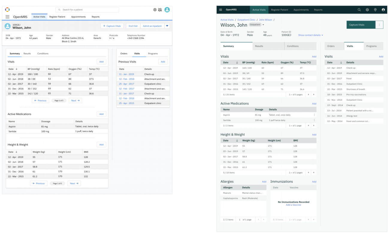
- We saw visual examples of the patient dashboard in Lightning Design and Carbon Design, and a number of pros and cons. There were more cons than expected for Lightning.
- We discussed the appeal of Bootstrap because it's something more devs are familiar with, and we want our system to be easy for Implementations to set up and resource; however, Bootstrap doesn't offer the full Design System guidance that's baked in to Carbon Design. The idea of using Bootstrap's components combined with Carbon's framework was also raised, with the recognized limitation that it would be more difficult to use a combo than to use a single source that links effectively to its own guidance.
- Result: We reached group consensus to try out Carbon Design as a Design System. JJ and Brandon will bring this recommendation forward to the TAC squad on Friday. The MFE squad will keep the community updated on their experience trying it out, and will let us know how easy it was to get going with in comparison to Bootstrap.
- Presentation: Link to slides
5. TAC Presentation - Aug 28
Coming August 28
6. Try out the recommendation and share progress/lessons learned with community
We will use videos and updates from the MFE squad both at TAC meetings and Squad Showcases to share how the experience of using the chosen Style Guide or Design System is going, and to show how it's practically been used vs painful vs helpful etc.
History of Style Guides in OpenMRS since 2018
Recent Ref App Efforts
We have some recent history implementing Twitter’s Bootstrap. There was a GSoC-2019 project on this topic: Bootstrap as a foundation for Reference Application UI Project (thread of updates from 2019 here. There were a number of upgrades done where ultimately Bootstrap was used to improve mobile responsiveness but we still kept the old RefApp style guide.
The changes were merged at the end of GSoC - but then issues started to pop up from here and there we had a lot of issues because of style conflicts.
In the Micro Frontend Squad
Exactly 1 year ago there was substantial discussion about whether to use a 3rd party Design System (e.g. Bootstrap, Material). we were very concerned that getting attached to a given 3rd party library would cause massive upgrade issues/tech debt we’d have to sort out whenever the 3rd party updated. We forsaw lots of independent groups of developers doing derivative work, making their own micro-frontends, and that it would be very challenging to coordinate shared library upgrades across the platform.. The decision was made that our MFE Squad would build and try-out our own home-built Styleguide 1 (repo here). Over the last year we’ve been trying out the OMRS style guide that we made at that time. Getting code-hitched to a 3rd party that causes us upgrade pain is still a concern (and arguably in tension with a core promise of MFEs: making front-end updates much easier). We are not the only organization with these concerns. Many organizations decide to use their own styleguide 2. But, not having clear design guidance (both for code and UI) is currently slowing us down, and we need to make the best use of the wonderful dev contributors we have available. We now recognize that a third party style guide makes sense, and possibly a full design system.
For a good summary of the principles the squad has been following since then, see RFC #10 on Styleguides and Design Libraries 1. Also helpful background is RFC #9: Styleguide javascript components. The full story of concerns and posts started here in a PR 3 and here in Talk 1 if you want to read about the pros and cons in detail.
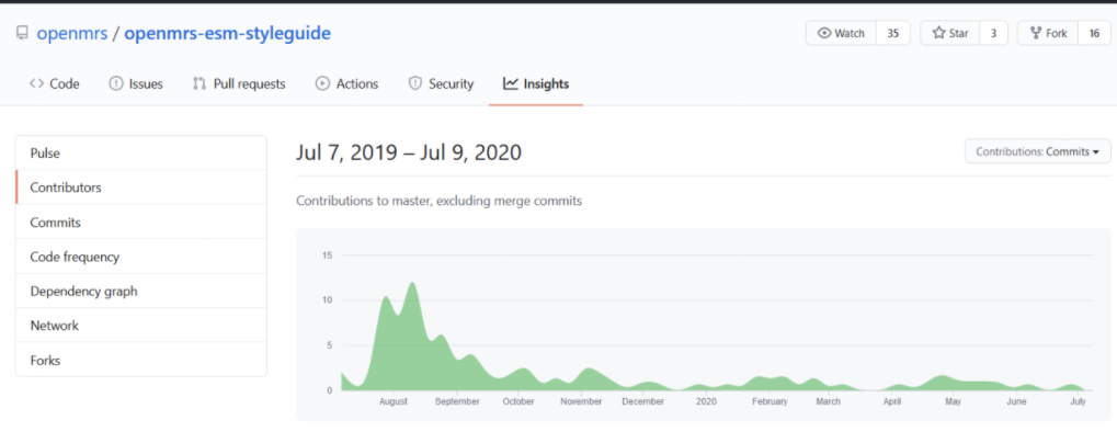
You can also see that the edit/maintenance history to this style guide has not been substantial over the last year.
Helpful Links
- Existing OMRS style guide
- MFE squad (ESM) style guide
- Overview of Design Systems presentation here
- Recent Style Guide Talk threads


